Bernay, Eure (1998) – A work by Bernard Buffet in tribute to Normandy
A painting by Bernard Buffet, a major figure in 20th-century French art
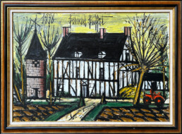
Created in 1998, Bernay, Eure is an oil on canvas painting by Bernard Buffet (1928–1999), an iconic figure in 20th-century French art. A painter of melancholy, incisive lines, and silent landscapes, Buffet is now recognized as an essential artist on the international stage. His works feature in the most prestigious collections and museums, and continue to attract keen interest from collectors, art lovers, and institutions.
Bernay, Eure: Normandy at the heart of Bernard Buffet's inspiration
Bernay, Eure is a painting that powerfully illustrates one of Bernard Buffet‘s recurring themes: Normandy. A region dear to the painter, it was for him a refuge from Paris, a place of contemplation and inspiration. Here, the Normandy landscape becomes the setting for a peaceful scene, almost suspended in time.
The composition features a half-timbered house, typical of Norman architecture, with its exposed wooden structure and massive volumes. On the left, a stone turret stands tall, while on the right, an orange tractor seems to have just returned from a freshly plowed field. This lively, almost anecdotal detail gives the work a human and contemporary dimension.
An autumnal atmosphere, between warmth and melancholy
The painting exudes a striking autumnal atmosphere. The bare trees with their rigid silhouettes, the pale yellow sky streaked with black, the brown furrows in the fields: everything evokes a season of transition, conducive to reflection. Yet, despite the severity of the lines, the overall effect remains warm and vibrant, thanks to the richness of the pictorial material and the depth of the colors.
Buffet captures a moment of rural life in an immediately recognizable aesthetic. The perspective of the central path, which leads to the door of the building, almost physically invites the viewer to enter this silent, intimate, and motionless world.
A typical work of the Buffet style
Bernay, Eure brings together all the elements that define Bernard Buffet’s artistic universe: strong architecture, stylized nature, powerful use of black, bold touches of color, and above all, an atmosphere that is both serious and poetic. Far from being austere, this painting is easy to live with: it captures the eye, evokes rural France, and arouses deep and immediate emotion.
Its large format, clarity, and formal richness make it a particularly emblematic work, both decorative and heritage-worthy.
Bernard Buffet and the Hurtebize Gallery: a lasting presence
The Hurtebize Gallery, located in Cannes and specializing in modern and contemporary art, has been supporting the market for Bernard Buffet‘s works for many years. His regular presence in the gallery’s exhibitions testifies to the importance it attaches to his work, both for its artistic value and for its role in the history of post-war French painting.
By regularly exhibiting major works by Buffet, the gallery allows an international audience to discover the richness of his work, his unique pictorial language, and his ability to powerfully convey simple and powerful emotions. Bernay, Eure is fully in line with this approach, embodying both the painter’s recognizable style and the depth of his attachment to the Normandy region.

Céline Fernandez
With 15 years of experience in marketing and communications, Céline has worked for major companies such as the Hopscotch agency, the Galerie Lafayette Group, and several communications agencies. Since 2019, she has been managing the gallery's communications through its website, social media, and traditional media.
Contemporary Summer Highlights : the gallery's summer exhibition
A selection of contemporary artists working between figuration and abstraction
For this summer season, Galerie Hurtebize is presenting a unique exhibition showcasing contemporary artists with distinctive artistic styles. Entitled Contemporary Summer Highlights, this exhibition brings together eight artists whose works range from stylized figuration to visual narration, gestural abstraction, and experimentation with materials.
Organized in two distinct spaces, the exhibition establishes a strong dialogue between two major currents in contemporary art: contemporary figurative representation and abstract research.
Contemporary figuration: narration, symbolism, and culture
In the first room, three artists explore contemporary figurative art through very different but complementary approaches:
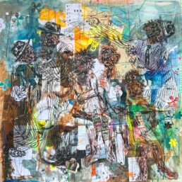
- Salifou Lindou offers compositions rich in contrasts, where drawing, collage, and visual symbols intertwine to evoke stories rooted in the African collective memory.
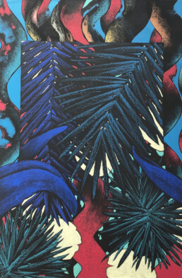
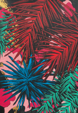
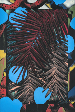
- Julien Colombier, meanwhile, deploys a graphic and decorative universe populated by stylized plant motifs, somewhere between abstraction and poetic figuration.
- Finally, Kim Duck Yong revisits the codes of traditional Korean painting through delicate and meditative pictorial marquetry.
Each of these artists offers a sensitive representation of reality, rooted in a strong cultural heritage and personal aesthetic research.
Abstraction: matter, gesture, and experimentation
In the second part of the exhibition, Galerie Hurtebize showcases artists whose work explores the expressive possibilities of materials and gestures:
- Bernard Bezzina works with paper as a sculptural material, playing with density, transparency, and light.
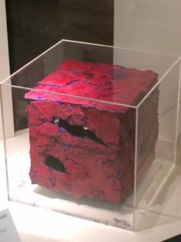
- Arthur Unger uses a rare pyrochemigram technique on copper, where chemistry becomes a tool for creation.
- Maryna Maryienko creates poetic abstraction through a secret technique that gives rise to unique organic textures.
- Jean-Jacques Marie continues the legacy of dripping with energetic gestural abstraction, where layers, movements, and colors are superimposed.
These works offer a true panorama of contemporary abstract creation, combining technical mastery and freedom of execution.
An exhibition to discover all summer long in Cannes
The Contemporary Summer Highlights exhibition is on display all summer long at the Hurtebize Gallery, located in the heart of Cannes, just a few steps from La Croisette.
🕦Opening hours: Monday to Saturday from 10 a.m. to 7 p.m.
📍Address: 17, La Croisette 06400 Cannes

Céline Fernandez
With 15 years of experience in marketing and communications, Céline has worked for major companies such as the Hopscotch agency, the Galerie Lafayette Group, and several communications agencies. For over four years, she has managed the gallery's communications through its website, social media, and traditional media.
The seasons as seen by Lebourg, Marquet and Valtat: three works to discover at Galerie Hurtebize
Galerie Hurtebize presents three emblematic modern paintings on the theme of the seasons, by Albert Lebourg, Albert Marquet and Louis Valtat.
Three artists associated with the École de Rouen or the École de Paris, each representing a key moment in the artistic evolution of the late 19th and early 20th centuries. Through these Impressionist, Fauvist and Post-Impressionist works, a whole vision of nature, light and time is expressed.
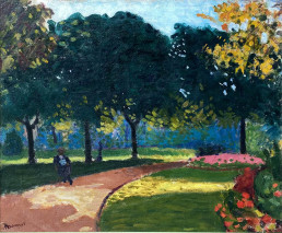
Albert Marquet – Jardin du Luxembourg, 1902
Birth of Fauvism - Springtime in vivid colors
A member of the École de Paris, Albert Marquet (1875-1947) belonged to the first generation of Fauves, although he differed from them in his personal restraint.
Painted in 1902, Jardin du Luxembourg was part of a pivotal phase: the artist, still influenced by the Nabis and his teaching at the École des Beaux-Arts alongside Matisse, was gradually moving towards a formal simplification that heralded the principles of Fauvism. Unlike his more flamboyant Fauvist companions, Marquet chose a vivid but measured palette, where each color structures space without ever dominating the composition. The artist subtly balances the construction of form and the brilliance of color, creating a scene that is both immediate and timeless. Through this urban landscape, Marquet imposes a poetic tranquility, characterized by diffused, controlled light, which transcends the moment to create a soothing vision of everyday life.
This work is both rare and precious, as Marquet would later turn to more pared-down compositions in pastel tones, in which color would become more suggestive than structuring.
This painting thus bears witness to a turning point, when the Nabis heritage intersected with a nascent modernity, typical of the spirit of the École de Paris.
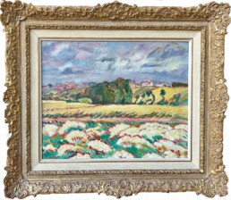
Louis Valtat – Champ de fleurs blanches et rouge en Normandie, 1924
Postimpressionism - An expressive vision of summer nature
Louis Valtat (1869-1952), a member of the École de Paris, occupies a special place between the last fires of Impressionism and the bold Fauves. A friend of Bonnard and Vuillard, from the late 1890s he developed a personal style based on pure color, simplified forms and a decorative touch.
In this Champs de Fleurs blanches et rouges en Normandie, we find all the features of his mature period. Flowers are not painted descriptively, but as rhythmic motifs. The stark contrasts and flattened volumes evoke a stylized vision of nature, in the tradition of Gauguin or Van Gogh, but without excessive subjectivity.
Typical of French Post-Impressionism, this work combines the energy of color with a solid construction inherited from observation of the motif. Valtat demonstrates his ability to synthesize emotion and mastery in a resolutely modern language.
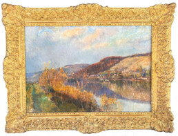
Albert Lebourg – Vue d’une rivière
Impressionism - Shades of autumn light
Albert Lebourg (1849-1928) was a figure of the Rouen School, a regional Impressionist movement active around the Seine at the end of the 19th century. Although less publicized than its Parisian counterparts, this school developed a particularly subtle approach to landscape, focusing on changing light, atmosphere and the poetry of the motif. The composition is masterful, and the masses of color are laid down with simplicity and balance.
Unlike his more flamboyant companions, Marquet opts for a more refined palette, where each color structures space without overwhelming it.
In Vue d’une rivière, he captures with great subtlety the banks of the Seine, enveloped in soft, changing light. The light seems absorbed by the material, and the reflections on the water suggest a peaceful autumn, observed without emphasis. Corot’s influence can be seen here, but transposed into a sensitive Impressionist vocabulary, close to Pissarro.
Lebourg works in small, juxtaposed brushstrokes, capturing the minute variations of light on water and foliage. This work is representative of Norman Impressionism, where the sincerity of perception prevails over the quest for the spectacular.
Three seasons, three masters, three paintings to discover
By bringing together these three works, Galerie Hurtebize highlights the diversity of views on nature between 1880 and 1930, within the main French artistic movements: Impressionism, Post-Impressionism and Fauvism. Each painting reflects a specific moment in the history of modern art.
These works are currently on view at the gallery. Please contact us to find out more or to arrange a private viewing.

Céline FERNANDEZ
With 15 years' experience in marketing and communications, Céline has worked for major companies such as Hopscotch, Groupe Galerie Lafayette and several communications agencies. For more than 4 years, she has been managing the gallery's communications through the website, social networks and traditional media.
Claude Venard - L'Atelier du Peintre (1962) I Galerie Hurtebize
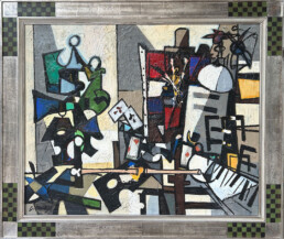
Claude Venard‘s L’Atelier du Peintre (1962), presented at Galerie Hurtebize, embodies the expressive power and rigorous construction that characterize his work. This oil on canvas, included in the catalog of the Villa Tamaris Pacha exhibition in La Seyne-sur-Mer in 1991, perfectly embodies his pictorial language: a rigorous construction in which the balance between abstraction and figuration imposes itself with force.
A vibrant tribute to the painter's studio
In this studio scene, Venard deconstructs forms to reinvent pictorial reality, somewhere between masterful abstraction and free figuration.
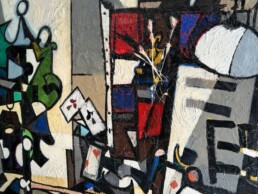
He assembles the familiar elements of his world – easel, brushes, color tubes, playing cards and sheet music – in a structured tangle of powerful black lines and angular geometric shapes. His universe oscillates between poetic everydayness and controlled chaos, where every object becomes a pretext for plastic exploration.
Venard‘s studio is more than just a place to work: it’s a vibrant theater where objects dialogue, respond and merge in energetic composition.
In this work, the artist pays sensitive, pictorial homage to his own creative space, both sanctuary and experimental ground.
An expressive technique: the art of sculpting paint
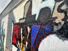
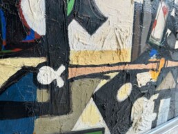
As usual, Claude Venard‘s work is richly textured, almost sculptural. The paste is generous, the impasto assertive. Every brushstroke, every zone of color testifies to controlled energy. Here, the artist applies a dense, impastoed material, creating a relief-like texture that lends the whole a tactile force and expressive intensity. The surface of the canvas becomes a plastic playground where the paint takes shape, rises, thickens, until it surpasses the simple flatness of the painting.
This way of exalting matter gives the work a striking physicality, as if each element had been shaped by hand.
A composition built on color and form
The chromatic palette, characteristic of his work, plays on strong contrasts: deep greens, blues and vivid reds clash with the neutral tones of the background, while light seems to spring from light and ochre areas.
A product of the post-Cubist movement, Venard‘s painting is free, solidly constructed and free of academic conventions. His work on L’Atelier du Peintre is a striking demonstration of this: rigorous in structure, free in expression. L’Atelier du Peintre thus continues his commitment to painting that is both rooted in the cubist tradition and resolutely turned towards a personal, expressive vision of reality.
An emblematic work
This painting testifies to Venard‘s stylistic maturity in the early 1960s. It powerfully captures not only the place of creation, but the very spirit of creation: teeming, chaotic, luminous.
Through L’Atelier du Peintre, Claude Venard offers us a powerful look at his own craft, with the sincerity and intensity that made him one of the great names of twentieth-century French abstraction.
Claude Venard honored at Musée Jean Couty - Lyon
Recognition of Claude Venard‘s work continues to grow, as evidenced by the exhibition “CLAUDE VENARD. Le post-cubisme du bonheur”
at the Musée Jean Couty in Lyon until May 4, 2025. For the first time, the Musée Jean Couty is devoting an exhibition to him, bringing together some of his most emblematic and singular works.
👉 The work can be seen at the Hurtebize Gallery. For further information, please contact us.

Céline FERNANDEZ
With 15 years' experience in marketing and communications, Céline has worked for major companies such as Hopscotch, Groupe Galerie Lafayette and several communications agencies. For more than 4 years, she has been managing the gallery's communications through the website, social networks and traditional media.
Crossed Destiny : Hans Hartung and Jean Miotte: two expressions, a common power
Hans Hartung and Jean Miotte. Through their recent works in our collection, we invite you to explore the subtleties of their pictorial language and the expressive power of their compositions. One, with his mastery of line and structure, the other, with his spontaneous gestural energy, each testify to a singular approach that has left its mark on the history of twentieth-century abstract art.
This article immerses you in the world of these two artists, analyzing their techniques, their influences and how their work continues to inspire the art world today. Between verticality and free gestures, intense colors and mastery of contrast, we offer you a cross-section of these two complementary approaches to abstraction.
Lyrical abstract art: a pictorial revolution and gestural expression
Lyrical abstraction emerged in the early 20th century as a reaction to geometric abstraction. Led by artists such as Jean Miotte, Hans Hartung, Georges Mathieu and Pierre Soulages, this movement is characterized by total freedom of expression, with gesture and energy dominating composition. The impact of this pictorial revolution can be seen today in many contemporary practices, where matter and movement become powerful means of expression.
In lyrical abstraction, technique is as important as intention. Miotte and Hartung are similar in the way they capture the immediacy of movement, but differ in their approach:
- Miotte translates a form of pictorial dance, a fast, fluid gesture.
- Hartung, on the other hand, prepares and anticipates his gestures to give them tension and structure.
Jean Miotte: Energy of line and spontaneity of gesture
Jean Miotte fully embraces the dynamics of lyrical abstraction, placing the spontaneous, instinctive, liberated gesture at the heart of his practice. His painting is a constant dialogue between full and empty, where movement takes precedence over fixed form. Inspired by the dynamism of dance and musical rhythm, Miotte expresses an inner strength that translates into compositions of remarkable intensity.
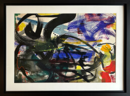
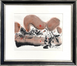
His works on paper, notably his 1956 ink and 1960 ink and gouache, perfectly illustrate this approach. The fluid ink of 1956 shows an immediacy of gesture, capturing the moment with great spontaneity. Conversely, the addition of gouache in his 60s work enriches the composition with a denser material, contrasting with the lightness of the line. These pieces reflect the absolute freedom Miotte claimed for her art, a quest for pure expression and unrestrained movement.
Nothing found.
Hans Hartung: Exploring line and matter
Hans Hartung, a master of lyrical abstraction, is renowned for his research into movement, texture and the interaction of different techniques. His work “P1972-1”, executed in ink and pastel on baryta board, perfectly illustrates his interest in the fusion of materials. This piece highlights his work on the verticality of gesture and the intense contrast of black with the touches of yellow and blue characteristic of his chromatic palette. Each stroke seems animated by a controlled energy, translating an almost musical tension.
His oil-on-canvas painting “T1963-U27” offers us another look at his technique. The deep black background serves as the basis for a superimposition of colored strata, in which the artist plays with shades of blue and ochre, reinforced by his scraping technique. This process, which consists in removing certain layers of paint to reveal the underlays, accentuates contrasts and adds a tactile dimension to the work. The dynamism of the line is prominent, with each line capturing a moment of tension and raw energy. His approach differs from Miotte’s in its methodical preparation of the gesture, making each movement calculated and impactful.
Nothing found.
Nothing found.
Miotte or Hartung in your collection?
For art lovers and collectors, choosing between Miotte and Hartung means questioning one’s own sensitivity to lyrical abstraction, but also considering the historical and heritage dimensions of these artists.
Jean Miotte captivates with his spontaneous, expressive approach. His works convey a vital energy, an outpouring of line that evokes pure movement. He embodies a free, immediate abstraction, sought after for its visual and emotional impact.
Hans Hartung, on the other hand, offers a more reflective reading of gesture. His tracings, often precise and incisive, are the fruit of deep reflection on the tension and dynamics of the stroke. His work is appreciated for its balance between rigor and spontaneity, making him a key figure in twentieth-century abstraction.
From a heritage and investment point of view, both artists benefit from international institutional and museum recognition. Their works are exhibited in the world’s greatest collections, and their value continues to grow. Investing in a Miotte or a Hartung not only means acquiring a piece of exceptional artistic value, but also inscribing your estate in the historical continuity of lyrical abstraction.
Through their singular approaches, Jean Miotte and Hans Hartung embody two complementary facets of lyrical abstraction. One favors the spontaneous burst of line, while the other structures his gesture with almost calligraphic precision. Their work, always imbued with strength and energy, continues to influence contemporary art and inspire collectors and lovers of abstraction. Galerie Hurtebize affirms its commitment to promoting and showcasing this artistic movement, highlighting works that bear witness to its evolution and impact on the history of modern art.

Céline FERNANDEZ
With 16 years' experience in Marketing and Communications, Céline has worked for major companies such as Hopscotch, Groupe Galerie Lafayette and several communications agencies. For over 5 years, she has been managing the gallery's communications through the website, social networks and traditional media.
"Sans Titre" (1994) de Karel Appel : Une Œuvre d'Énergie et de Liberté Créative
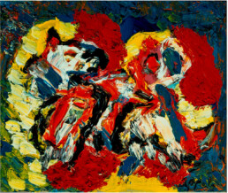
Karel Appel, a leading figure in the CoBrA movement, has left his mark on art history with his vibrant, instinctive and deeply expressive works. In 1994, he produced “Untitled”, an oil on canvas that illustrates the power of his creativity and the singularity of his style. This canvas, now on show at Galerie Hurtebize, is a dazzling testimony to Karel Appel‘s artistic maturity and his desire to push back the boundaries of conventional art. Let’s take a look at this energetic work.
A whirlwind of colors and textures
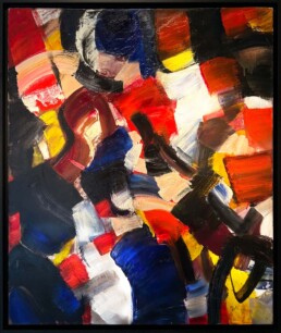
“Untitled” (1994) stands out for its bold palette of primary colors: red, yellow and blue dominate the composition, accompanied by touches of black and white. These colors clash and merge in a chaotic harmony that immediately captures our attention. Appel plays with powerful contrasts here, transforming the canvas into a visual explosion that seems on the verge of overflowing its boundaries.
Renowned for his energetic style, Karel Appel uses vivid colors and thick textures to create works of raw expressivity. In this canvas, he applies paint with great spontaneity, giving rise to a rich, dynamic surface. His broad brushstrokes and thick impasto give the canvas an almost sculptural dimension. This material work reflects his experimental approach to art, freeing painting from academic conventions in favor of free, instinctive expression.
His mantra, “I paint like a barbarian in a barbarian age”, reveals his whole philosophy: his works translate visceral emotions and the violent feelings that the world inspires in him. It’s this raw strength and quest for authenticity that makes his art so captivating and timeless.
A reflection of Karel Appel's artistic maturity
By 1994, Karel Appel was already an accomplished artist, internationally recognized for his role in the CoBrA movement and his contributions to abstract and expressionist art. By this stage in his career, he had perfected his style while remaining true to his creative instincts.
Unlike his works of the 1950s, marked by a certain urgency and a search for a break with academicism, “Untitled” bears witness to an artistic maturity. Appel displays technical mastery and absolute confidence in his visual language. He doesn’t hesitate to explore matter, color and gesture in even bolder ways, while retaining the raw energy for which he is renowned.
The CoBrA movement: a pervasive influence
Although “Untitled” was produced several decades after the CoBrA movement dissolved in 1951, the influence of this collective is still perceptible in Appel‘s work. CoBrA, an acronym for Copenhagen, Brussels and Amsterdam, brought together artists who shared a common desire to break with academic rules and rediscover a free, intuitive and spontaneous art form.
The principles of the movement – such as an interest in primitive forms, the childlike imagination and the spontaneity of gesture – are evident in this painting. Appel continues to build on this heritage, while bringing his own vision and experience gained over the years.
An immersive and captivating work
“Untitled” is not just a painting: it’s an experience. Looking at this canvas, the viewer is transported into a whirlwind of emotions and energy. The richness of the textures, the vivacity of the colors and the power of the pictorial gesture create a total immersion in Karel Appel‘s universe.
Each glance at the work reveals new details, new interactions between colors and shapes. This visual complexity is one of the most fascinating aspects of Appel’s work, which manages to capture the viewer’s attention while leaving him free to construct his own interpretation.
Karel Appel's legacy and its relevance today
More than 15 years after his death, Karel Appel‘s art continues to resonate with art lovers and collectors the world over. His unique approach, blending instinct, emotion and daring, remains a source of inspiration for many contemporary artists.
This “Untitled” work from 1994 bears witness to the timeless relevance of his work. It reminds us that art, when sincere and authentic, can touch hearts and minds deeply, whatever the era or context.
Discover “Untitled” at Galerie Hurtebize
Galerie Hurtebize is proud to present this exceptional work by Karel Appel. A true gem of contemporary art, this canvas is an invitation to explore the vibrant and audacious universe of an artist who has left his mark on the history of art.
Come and discover “Untitled” (1994) and let yourself be carried away by the energy and passion that emanate from this unique creation. This is a rare opportunity to admire up close a work that embodies all the strength and vitality of Karel Appel.

Céline FERNANDEZ
With 15 years' experience in marketing and communications, Céline has worked for major companies such as Public Système, Groupe Galerie Lafayette and several communications agencies. For over 4 years, she has been managing the gallery's communications through the website, social networks and traditional media.
Daniel Buren - Visual and Spatial Exploration at Galerie Hurtebize
Galerie Hurtebize is proud to present works by artists who have left their mark on art history. Daniel Buren, with his formal rigor and ability to transform spaces with simple repetitive patterns, is a valuable addition to our collection. Our gallery highlights works that question, transform and inspire. This work by Buren is an invitation to reconsider urban spaces, through the unique vision of a master of abstraction.
The Language of Shapes and Colors by Daniel Buren
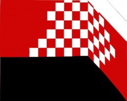
Daniel Buren‘s work, presented here by Galerie Hurtebize, perfectly illustrates the radical artistic approach of one of the most influential contemporary artists. This piece is characterized by its emblematic use of geometric lines, notably red and white squares juxtaposed against a background where contrasts are accentuated by a deep black zone. These simple shapes, organized with rigor, create a fascinating play of perspectives that plunges the observer into an optical and spatial exploration.
What makes this work unique
Buren‘s work is immediately recognizable by the symmetry of its motifs and the minimalist use of red, white and black. The choice of a restricted palette highlights the structure of the work, evoking an interaction between the two-dimensional plane and three-dimensional space. The squares, carefully arranged, seem to unfold along two rising walls, amplifying the effect of depth and provoking a sense of visual movement.
The use of color is equally striking: the intense red contrasts with the pure white, creating an effect of light and volume, while the black part gives the impression of solidity and foundation, anchoring the work in space.
The Meaning of Work by Daniel Buren
Daniel Buren is known for his site-specific interventions and public works that play with architectural space. The theme of repeating geometric patterns is central to his practice, and can be seen in this piece exhibited at Galerie Hurtebize. Buren explores the concepts of limit, context, and how the environment influences the perception of art.
This work uses the codes of geometric abstraction and leads viewers to perceive walls as dynamic surfaces.
Why buy a Daniel Buren artwork?
Owning a work by Daniel Buren is first and foremost an immersion in the world of conceptual and minimalist art. His works are thought-provoking pieces that question spaces and the limits of the artistic framework. As a collector, owning a Buren means participating in a living and influential artistic history, where the visual language of abstraction meets spatial experimentation.
Collectors appreciate his works for their ability to transform the space in which they are presented, creating environments that stimulate critical and aesthetic thought. What’s more, Buren is an artist of international renown; his works are present in the world’s leading collections and exhibitions, guaranteeing both artistic and investment value.
The Visual Power of Buren
Daniel Buren‘s mastery of color and repetitive motifs continues to captivate and transform spaces. This work, with its unique combination of red, white and black, is a perfect illustration. At Galerie Hurtebize, we’re delighted to be able to offer our visitors a chance to see and acquire works that push the traditional boundaries of art. Come and explore, experiment and enrich your collection with one of the most iconic names in contemporary art.
Visit the Hurtebize Gallery to discover Daniel Buren
We invite you to discover this fascinating piece by Daniel Buren and many other works by major artists of the 20th and 21st centuries. Please do not hesitate to contact us to find out more about the works available or to arrange a personalized visit.

Céline FERNANDEZ
With 15 years' experience in marketing and communications, Céline has worked for major companies such as Hopscotch, Groupe Galerie Lafayette and several communications agencies. For over 5 years, she has been managing the gallery's communications through the website, social networks and traditional media.
Contemporary Eclecticism at Galerie Hurtebize: Art in Dialogue
Galerie Hurtebize is delighted to share a selection of contemporary works in which we highlight unique artistic universes, where styles, techniques and themes intersect and dialogue. Each artist explores a singular vision, reinventing our relationship to the world, to matter and to emotions.
Discover the vibrant and captivating works of Julien Colombier, Jan Kolata, François Malingrey, Daniel Buren, Salifou Lindou, Jean-Jacques Marie, and Kim Duck Yong. Their diversity of techniques and perspectives offers a veritable panorama of current trends in contemporary art.
Artists in the spotlight
Julien Colombier : Botanical hypnotism
Julien Colombier invites us into an imaginary jungle with his saturated, stylized plant motifs. His works are explosions of color, where shapes overlap to create an almost hypnotic atmosphere. Through these vivid, dynamic contrasts, Colombier transforms nature into an immersive sensory experience. His use of pastel on large surfaces reinforces the visual intensity of his compositions, offering a soft yet vibrant texture. Each plant element, often simplified and stylized, seems to float in controlled harmony.
Jan Kolata : Color and transparency effects
Jan Kolata explores the infinite possibilities of color through superimposed layers of paint that gradually reveal themselves. His abstract works play subtly with transparency, revealing nuances that interact with one another. Each layer of paint becomes a stratum of light, a translucent veil revealing what lies beneath. This interplay of superimposition and transparency lends her works a unique depth, where colors constantly blend and reinvent themselves, capturing the eye and inviting prolonged contemplation.
François Malingrëy : A reflection of humanity
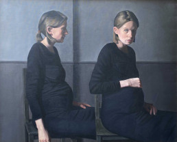
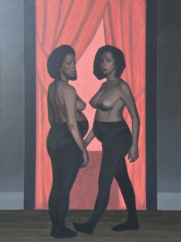
François Malingrëy‘s work explores the light and shadow of human intimacy. His characters, often strange and unsettling, capture our attention and arouse ambivalent emotions. Her canvases plunge us into complex human realities, blending familiarity and strangeness, offering a profound reflection on the human condition. His technique is marked by an almost photographic precision in the rendering of detail, creating a striking realism that amplifies the unsettling character of his works. Malingrey also plays with strong contrasts between light and dark, reinforcing the dramatic intensity of his scenes and heightening the viewer’s sense of unease or fascination.
Salifou Lindou : A social and political exploration
Salifou Lindou, an artist from Cameroon, tackles social and political issues with an energetic, expressive style. His compositions illustrate intense, emotionally rich human interactions, echoing universal issues. His work, deeply rooted in social reality, brings cultures into dialogue and highlights the power of human exchange. Lindou often uses raw, spontaneous lines, creating a visual dynamism that reflects the energy of human interaction. He also works with mixed media, blending drawing, painting and collage to accentuate the texture and depth of his compositions, reinforcing their visual and emotional impact.
Jean-Jacques Marie : Raw abstraction
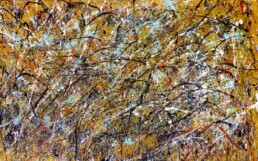
Jean-Jacques Marie‘s art is characterized by a raw approach to abstraction. Through a mastery of gesture and material, he expresses a powerful, spontaneous energy. His works reflect a tension between chaos and control, creating pure, intense forms that captivate with their expressive power. He favors broad, free gestures, letting the paint unfold with a certain spontaneity, while maintaining precision in composition. His use of material, often thick and textured, adds a tactile dimension to his canvases, inviting the viewer to physically feel the energy contained in each brushstroke.
Kim Duck Yong : Ephemerality and light
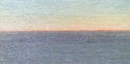
An artist from South Korea, Kim Duck Yong explores the ephemeral through luminous, delicate compositions. His works often evoke twilight landscapes, where light and texture merge in mysterious harmony. He is renowned for his unique technique, combining wood marquetry, paint and mother-of-pearl inlays. He harmoniously blends traditional and contemporary materials, creating delicate works where finely worked wood is combined with touches of color and chips of mother-of-pearl. Each piece reflects a subtle balance between Korean tradition and a modern artistic approach, creating a visual universe that is both timeless and captivating.
An encounter between styles and worlds
Through the works of these seven artists, Galerie Hurtebize celebrates the diversity of form and style that characterizes contemporary art. Each artist proposes a personal and singular approach, offering a range of perspectives that enrich our understanding of today’s world and art.
This plurality of artistic expression finds its strength in the way these creators explore universal themes. Whether nature, humanity, light or matter, each artist approaches these subjects with his or her own sensibility, bringing a unique voice to common reflections.
These artists, though different in style and approach, are united by their ability to transform timeless themes into bold contemporary visions. It is this wealth of styles and points of view that makes this selection a captivating panorama of contemporary art. Far from taking a homogeneous or one-dimensional approach, each work contributes a stone to the edifice of a collective reflection on the major artistic, social and spiritual issues of our time.
Galerie Hurtebize invites you not only to discover works of great diversity, but also to explore how contemporary art constantly pushes back the boundaries of our perception and enriches our understanding of the world around us.
Practical information
Follow us on our Intagram page @galeriehurtebize.

Céline Fernandez
With 15 years' experience in marketing and communications, Céline has worked for major companies such as Hopscotch, Groupe Galerie Lafayette and several communications agencies. For more than 4 years, she has been managing the gallery's communications through the website, social networks and traditional media.
Interview with Michel MOUSSEAU
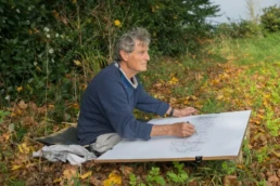
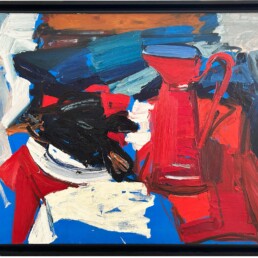
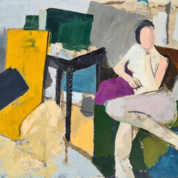
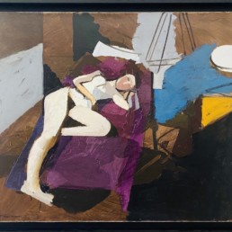
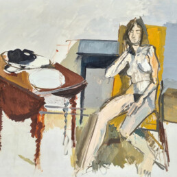
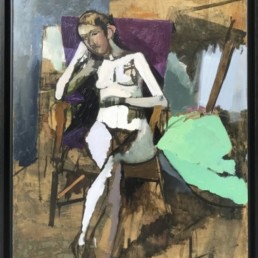
Discover our exclusive interview with Michel Mousseau, self-taught painter. To coincide with our exhibition “Michel Mousseau, The 60s“, the artist shares with us his unique career path, his artistic influences and his singular vision of painting. From his first aesthetic revelations to the nudes and still lifes that are emblematic of his work in the 60s, discover the thoughts and emotions that have shaped his work. Dive with us into Michel Mousseau‘s captivating universe and explore the themes and techniques that make his work a vibrant celebration of light and colour.
Q1 Can you tell us about your artistic career and what led you to become a painter?
I’m self-taught, with no formal artistic training. When I was a teenager at lycée, I was lucky enough to see some authentic paintings by Soutine and Modigliani at the home of a friend’s mother, who was a painter herself. It was a revelation.
Also at school, the short films on painting from all periods shown to us in art class by our teacher, Mr Jean Couy, a painter, were very formative for me. He introduced me to Cézanne.
I started drawing very early on, making lots of small, very precise drawings, which I unfortunately threw away. After that, I went to evening painting and drawing classes on Boulevard du Montparnasse in Paris. I was very assiduous but never received any advice from the painters or draughtsmen who taught there.
My first aesthetic emotion was discovering the ocean at Pornic. Coming from Paris by bike, I remember the violence of that dazzle, that horizon so far away from the sea.
I must add that what seems to me to have been very formative in my journey as a painter are the worlds of my two grandparents. One was a blacksmith, the other a baker. I have an image of the forge, it was a very dark place. And there was this glint of red iron on the anvil in the middle. These two worlds, one of Black and fire, the other powdery, flour-white, making everything light and silky, including the floor and walls, these two worlds created a chromatic base that I have never stopped developing.
Q2 Which artists or artistic movements have most influenced your work, particularly in the 60s?
I discovered Cézanne, Rembrandt and Gainsborough. Cézanne and Matisse are familiar to me. I discovered Les Ménines by Vélasquez at the Prado in Madrid. It was also a time when I saw major exhibitions devoted to Picasso and Poussin, whose The Seasons touched me deeply. But what really struck me first in painting was De Staël. Klee, Mondrian and Joan Mitchell are among the painters whose work particularly interests me. Jean Hélion was also one of my discoveries at the time.
Q3 What inspired you to create the nudes and still lifes presented in this exhibition?
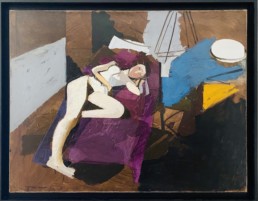
I was struck by the work of Richard Lindner, for example. He’s an American painter. The fundamental problem with his work is the relationship between things and the flesh, the flesh being a particular element of what surrounds us. I loved painting nudes, with their design and movement.
I see my work as a painter as a quest, a search, to which I associate the notion of pleasure. For me, research and pleasure are two words that define my attitude to painting. I left the Sorbonne and the wonderful Jankélévitch to live painting.
Q4 Can you explain your choice of colours and textures in your 60s paintings?
I come back to the image of the forge. This question of origin, in many ways including the reference to Courbet, is at the heart of my research. Courbet and the Origin of the World rather than the Impressionists. Perhaps that’s where my taste for black comes from, because black generates light, receives light, whereas yellow reflects it. Yellow is brilliant, it’s like gold. Soulages only worked with black, but his blacks are often coloured.
Over a long period of time, I’ve been interested in the “Fabrique du Noir”, or the Black as internal light. In other words, black is either red or blue, hot or cold, it is itself a varied colour, whereas lemon yellow is always lemon yellow, it’s a bit silly, it only reflects lemon yellow.
I insist on the continuous nature of my work. If there are periods, they are periods of continuity, the continuity being light and therefore light from what I call “The true colour of things“. It’s a title given to me by the poet Georges Schehadé. The true colour of things, that’s what I’m looking for.
But let’s not forget the fundamental pleasure of spreading colour, of receiving colour in the eye – it’s mysterious, it’s magnificent.
Q5 How do you approach the theme of intimacy in your nudes?
My subject is painting. For me, it’s not about reproducing or representing “things”, an object, a body or a landscape, but about capturing what catches the light.
My Nudes have been described as “pensive”. Thoughtful, yes, in the sense that I don’t tell stories. I’d say more detached, with a certain contemplative distance. It’s completely sensual, in the sense that a human body is not an object but a receptor of light.
Painting is first and foremost about seeing and making others see. Revealing without getting bogged down in anecdote. Painting expresses reality in all its transience and strangeness. It gives to see, it is to be seen. My painting is neither descriptive, narrative nor explanatory. I don’t paint objects or nudes, but I paint the light on objects and bodies in relation to the space in which they are.
So there is no question of intimacy, even when the subject is a human body. The human body, along with its surroundings, is a place that is taken over by painting, which searches for and through itself.
I see continuity in my work, I repeat. Continuity in the search for light, for matter, for that which resists the superficial gaze.
To paint nudes is not to try to capture or provoke desire or eroticism; it’s to investigate the enigma of reality that the painter’s gesture attempts to define through form, texture and colour. It is up to the viewer, if they so wish, to interpret the motif, the subject if that is what interests them.
Q6 How did the 60s influence your art?
During the period when I painted the canvases you are exhibiting, I wasn’t at all on the lookout for political or other events. At that time I lived in an artistic and intellectual milieu that included Roland Topor, Olivier O. Olivier and the regulars at Castel. In the theatre, I worked with Georges Wilson, Georges Vitaly and Daniel M. Maréchal, saw Pierre Arditti, Claude Brasseur and Sylvia Montfort, and was in contact with gallery owners Margueritte Motte and Robert de Bolli. I met a lot of poets, including André Salmon and Georges Schehadé. I live between Paris, Brittany and the Var.
My annual visits to the Cotentin region began in 1964. There I rediscovered the immensity of the skies and the sea. This was to give a new direction to my work.
Q7 What message or emotion would you like to convey through your work?
Open your eyes. To look. Seeing, that’s my project. I’m an optical glutton. The viewer is free.
How can we not hope that art remains at the heart of our lives?
Q8 What do you think is the place of art in today’s society?
Today’s art is more oriented towards representation and illustration than towards exploration. Contemporary art is more about DIY. I would say that Picasso was a genius at tinkering.
I ask the question, what does it mean to ‘see’? Because if you can’t see any more, what’s left? There’s nothing left. What is dying, if not no longer seeing? In short, painting is like a touchstone for existence.
Painting is a gesture of recognition, a form of homage to Creation. It is also a privileged meeting place with oneself and with those who have contributed to making the world a living place.

Céline Fernandez
Forte d’une expérience de 15 ans dans le marketing et la communication, Céline a travaillé pour de grandes sociétés telles que le Public Système, le Groupe Galerie Lafayette et plusieurs agences de communications. Depuis plus de 4 ans, elle gère la communication de la galerie à travers le site internet, les réseaux sociaux et les médias traditionnels.
Bosse (1971) by Georges Mathieu: A Calligraphic Work at Galerie Hurtebize in Cannes
Galerie Hurtebize in Cannes presents “Bosse” (1971) by Georges Mathieu, a pioneer of lyrical abstraction. Created using a mixed technique on paper, this work perfectly embodies the artist’s innovative spirit and technical mastery.
Georges Mathieu: A Master of Lyrical Abstraction
Born in 1921, Georges Mathieu has become a leading figure in lyrical abstraction, an artistic movement that favors spontaneity and emotional expression. In contrast to geometric abstraction, Mathieu favors immediacy and improvisation, creating works in which every stroke reflects pure, immediate emotion. His bold approach not only marked his era, but continues to inspire contemporary artists. His public performances, in which he painted gigantic works in a matter of minutes, captured worldwide attention and set new standards in the world of abstract art.
Description of work "Bosse" (1971)
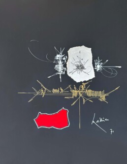
“Bosse” is a perfect illustration of Georges Mathieu‘s lyrical abstraction. The work is composed of a set of very fine gold, black and white signs, arranged in such a way as to create a calligraphic harmony. Positioned in the center of a deep black background, this minimalist arrangement of lines and shapes induces an intense energy. The contrast of colors and the finesse of the strokes underline the artist’s dexterity and the depth of his artistic vision.
- Color Palette: The work uses a restricted palette of three colors – gold, black and white – which reinforces the visual and emotional impact of the composition. This deliberate limitation of colors highlights the brilliance of the golds and the sobriety of the blacks and whites, creating a captivating visual tension.
- Techniques used: Finely worked in gouache, every line and sign testifies to the artist’s speed of execution and freedom of gesture. This technique captures the immediacy of gesture and the fluidity of movement, making each work unique and spontaneous.
- Harmonious Layout: Signs are arranged to create a harmonious, balanced whole, evoking abstract calligraphy. This arrangement reveals a meticulously considered composition, where each element finds its place to form a coherent, expressive whole.
The Principles of Lyrical Abstraction
Georges Mathieu overturned theories of painting by defining four fundamental criteria for creating his works:
- Primacy of Speed of Execution: Speed captures the essence of the moment and expresses raw energy. This approach favors spontaneity, eliminating any form of calculation or rigid planning.
- No Pre-existence of Forms: Shapes are not predefined, allowing total creative freedom. This absence of prior structure gives rise to pure authenticity of artistic expression.
- No premeditation of gestures: Every gesture is spontaneous, reflecting the artist’s authenticity and sincerity. This method values instinct and raw emotion, as opposed to intellectualization and rigid technique.
- Necessity of a Second State of Concentration: The artist must achieve a state of intense, almost meditative concentration to create works of such intensity. This state enables the artist to transcend ordinary consciousness and access a deeper, truer form of expression.
The Calligraphic Period of Georges Mathieu
Prior to his flamboyant 80s period, often referred to as the “fireworks” period, Georges Mathieu explored a significant calligraphic phase. It was during this early period that Mathieu defined the foundations of his distinctive style. Influenced by oriental calligraphy, he developed a technique that blends speed and precision of gesture.
The influence of the Far East
In 1957, during a stay in Japan, Georges Mathieu came into contact with Japanese calligraphy and tradition, which considerably enriched his artistic approach. André Malraux had already described Mathieu as a “Western calligrapher” in 1950, establishing a link between his work and Far Eastern calligraphy. Mathieu was inspired by the calligraphy techniques used by Buddhist monks, where writing and ink painting are often inseparable.
The Calligraphic Nature of the Work
In the Far East, calligraphy is often imbued with a philosophical and spiritual aspect, in contrast to Western calligraphy, which is more focused on the aesthetics of beautiful writing. Mathieu has transcended this dichotomy by integrating the speed and spontaneity of Eastern calligraphy into his own work. In this sense, his works are not limited to mere aesthetics, but become a pure expression of emotion and energy.
Speed and Sign
Georges Mathieu bases his research on the abstraction of his signs. For him, the abstract sign denies any meaning prior to its creation, in contrast to traditional calligraphy where each sign has a precise meaning. In 1963, in his book “Au-delà du tachisme”, Mathieu explains that the background of his canvases takes on more uniform tones, making the signs more independent and precise. This rapidity of execution and spontaneity of gesture translates raw, immediate emotion, a principle that is repeated in “Bosse“.
Discover "Bosse" at Galerie Hurtebize
Galerie Hurtebize in Cannes invites you to discover “Bosse” and plunge into the expressive, dynamic world of Georges Mathieu. This unique piece is a true testament to his innovative artistic approach. “Bosse” is an invitation to feel Mathieu’s creative energy and appreciate the beauty of lyrical abstraction in all its splendor.

Céline Fernandez
With 15 years' experience in marketing and communications, Céline has worked for major companies such as Public Système, Groupe Galerie Lafayette and several communications agencies. For over 4 years, she has been managing the gallery's communications through the website, social networks and traditional media.


